Have you ever visited a website and don’t know what is happening? There are so many elements around trying to get your attention and there doesn’t seem to be a clear path you can follow. Or on the contrary, there is no indicator that shows you how to navigate said site.
Having clear CTA's helps your users know what action to take next and meet the desired flow without problems.
What is a CTA?
A CTA, as the name implies, is a call to action. It is an element that indicates the way to follow to meet your goals within a website or app, whether it is visiting another site, starting a download, buying a product, etc.
Characteristics of a good CTA
A CTA must be able to be easily identified so as not to confuse users and can be differentiated from other elements by its color, size or location. It can be presented in different shapes and sizes, either text only or accompanied by icons that help reinforce the message you want to convey, to help users feel comfortable and confident that the next click will take them where they want to go.

Imagine that you want to buy an item from an online store, but among so many items you don’t find the "add to cart" button, clicking the wrong button can cause the purchase of an unwanted item or perform an action different than what you expected.
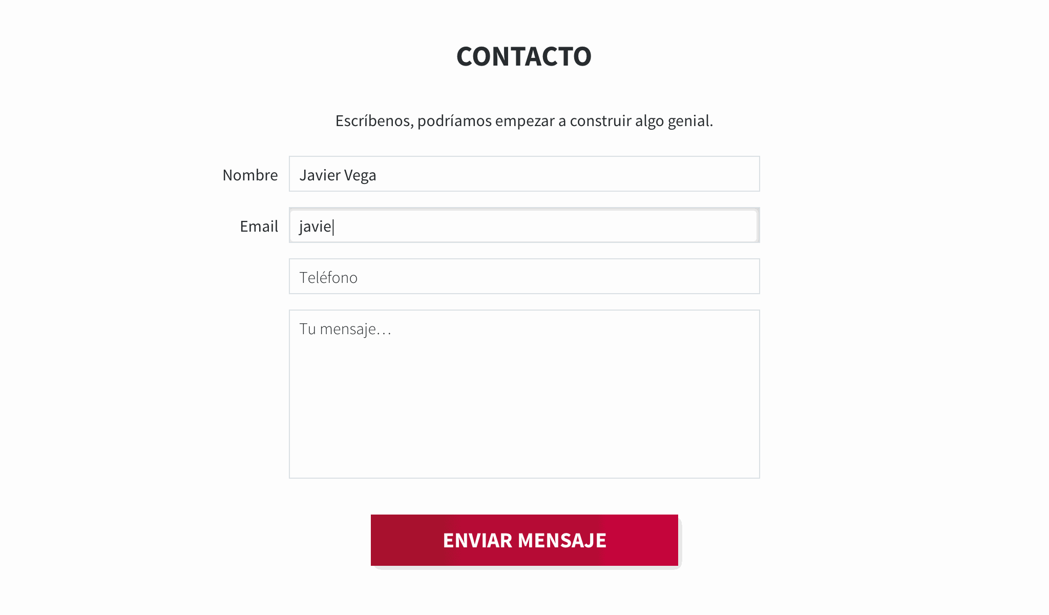
For example: In a contact form, the desired objective is to send a message, but how are we going to achieve it? By clicking on the CTA that tells us what action to take.

In this case the text is clear as to what we want to achieve (send message) and in turn the button stands out for its size and color over the other elements in its environment to help the user to locate it easily.
Target audience
A CTA must be designed thinking that any user, regardless of their technical level, understands their function and does not have to guess what will happen when they click it.
Before defining a CTA, we need to know to whom it is directed and what action we want users to perform when they click it, this in order to generate a better navigation flow and in turn increase the conversion or leads.
Copy
Having a well designed CTA helps clarify the picture, but if accompanied by a good text that guides the user to click the button helps improve the user experience and increases the chances that users are interested in the CTA.
The text of a CTA must be short and concise so that our users understand quickly and clearly the action that will trigger the button.
A CTA with a clear message is vital and can be done in different ways: Ask the system to allow you to perform the action (01), tell the system to perform the action (02) or let the CTA itself show you the way ( 03).

It is recommended to use sticky words or phrases that hook with users and provoke the desire to click on the button.
Location
For a CTA to work properly, we need to place it in a space free of distractions so that it is easy to find by users. We must respect the space around it and place it at a prudent distance from other elements related to the action we want our users to perform.
Hierarchy
Having many CTAs in a small space can confuse the user. In these cases we must rank the importance of each CTA and classify them as "primary", "secondary", etc. and thus give users a clue as to which action is more important.
One way to define hierarchy is by varying the size and color of the button and creating contrast with the other elements to differentiate each other.

How to measure the efficiency of a CTA?
There are several ways to know if a CTA is fulfilling its mission. We can do tests with users before publishing the site and according to their behavior know if it works correctly, or if their answer is negative we have to rethink a better way to present it.
When the site is published we can measure the effectiveness through analysis metrics, monitoring the activity of users with that element. Another way is to review activity maps with tools such as hotjar that shows the path of users through your site.
In summary, a well-designed CTA can be your best ally when it comes to guiding your users to comply with a previously defined flow.