Throughout this blog post we will explain the meaning of A / B testing? What does it consist of? And four reasons why you should implement it in your company.
Currently, there are various tools that we can use to improve our marketing strategy, companies need to be at the forefront and know all the advantages that technology offers. In this blog post we tell you what A / B testing is and how you can use it to your advantage to improve your e-commerce.
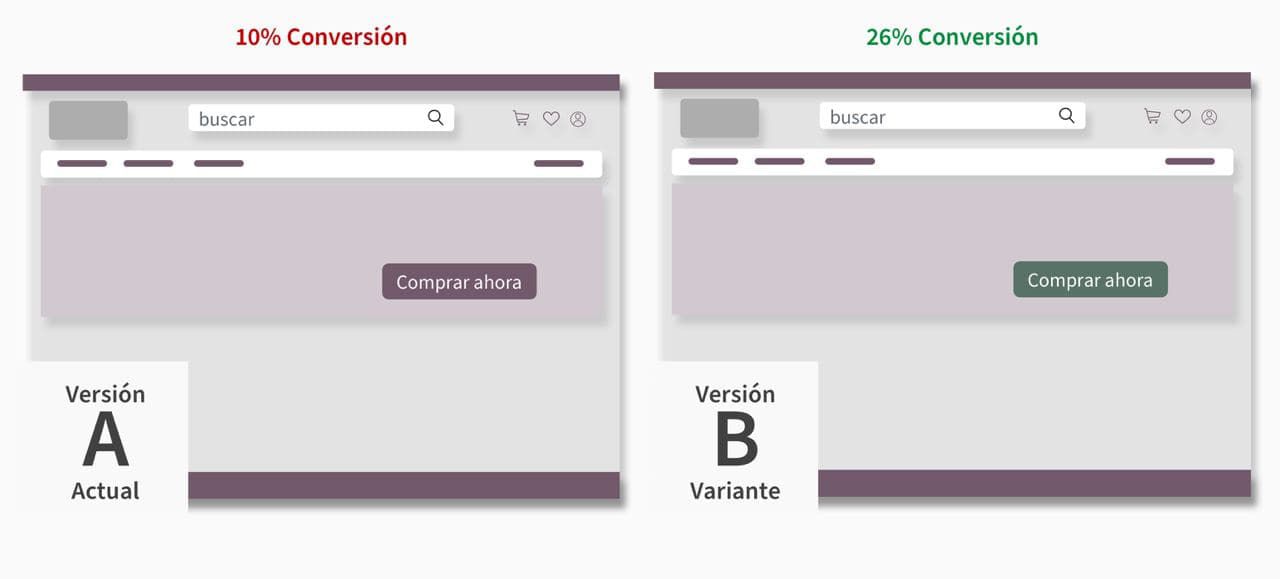
A / B testing consists of creating two versions of a website or an application (or a section of them), where A is your original version and B the alternative version, in order to compare which of the two has a greater impact and positive result on users.
The tests that are carried out can range from comparing the color of an action button to changes in the texts: how do we speak to the user? The idea is to improve the experience on our sites or applications in order to have better performance in e-Commerce, blogs, mass mailing, among others.
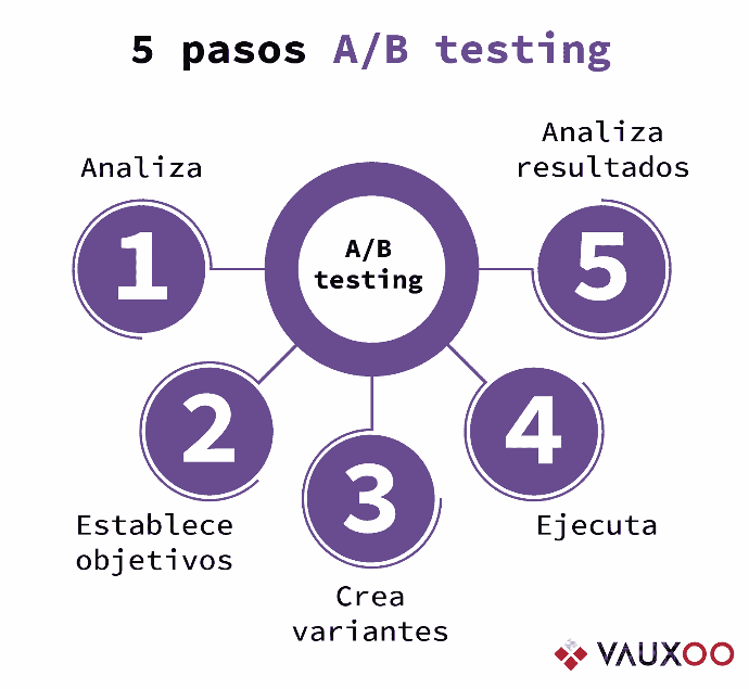
5 steps to A / B testing
The health of your business is important, so having the regular implementation of A / B testing on the radar will bring you gratifying benefits. So we will share the 5 steps of the methodology:
1. Analyze. Understand the conditions of what you want to test, analyze and think about the problems you would like to solve.
2. Set goals. Establish the objectives you want to achieve: increase in sales? Greater number of leads? Improve conversion rate? Once established, analyze the elements that influence these objectives and see what you could change.
3. Create the variants. Once the objective has been defined and the elements that influence it have been analyzed, it is time to create two versions of the same element, you must make sure that they are the same in all other aspects. For example: If your goal is an increase in leads, maybe changing the CTA element is an option, starting by changing the text: "Request it here" and another with "1 month free trial"
4. Execute. It is time to launch it to a group of users, it must be taken into account that the test time may vary depending on the traffic of the page or application to be tested.
5. Analyze the results. Which one had a higher conversion rate? Which one had a higher percentage of clicks? Which one allowed a higher rate of registrations to the form? With this information you will be able to make a decision to make the pertinent modifications to your site or application.

4 reasons to A / B testing
Reinforcing the positive reasons for making use of these tests, we present the most important ones:
1. Preferences. One of the objectives of A / B testing is to find out what users prefer, to know what type of elements are more likely to make the user click, make a purchase or become a lead.
2. Conversion rate. Is your website new? Do you already have a good number of visits? You should assess these aspects to apply testing or a mass mailing campaign where you can invite users to test your app or website.
3. User experience. By putting A / B testing into practice, we listen / understand the user's perspective. Based on button color tests, layout structure or even wording. With this we obtain results that help us to provide you with a satisfactory experience for your navigation on the site or application.
4. Real data. The biggest advantage of all is that you will make decisions based on completely real data, not on hypotheses, where your own clients provide you with the information to improve, after the tests carried out.
Where do you implement A / B testing?
All of these aspects can greatly impact the conversion rate on your app or website:
Text. Any text has an important role, try different sizes, fonts and colors.
The visual structure of the page. You can experiment by placing different elements on different sides, adding or deleting categories, images, etc.
Offers and promotions. You can offer them in different colors, shapes, location.
The presentation of your products. Play around with the presentation, you could see what kind of images work best, as well as the size and position in which they are.
CTA. It is the most important, try different sizes, their location, colors and their shape.

Tools to implement A / B testing?
We present you some effective tools for A / B testing, most of them are very easy to use, without the need for technical skills. They will help you to optimize the conversion rate in a simple way:
AB Tasty.
Google Analytics.
Google Optimize.
Crazy Egg.
Mixpanel.
KISSmetrics.
Optimizely.
Unbounce.
To get the best results you need to be patient, make one change at a time, so you can be completely sure what worked each time.

The main idea is to start from a hypothesis, investigate, implement and understand with the results obtained the need of our user, in addition to iterating in trial and error to find what captures the most attention from your customers, A / B testing can be a great ally in your marketing campaigns for eCommerce, Blogs, Promotions, among others and helps you have a much healthier site where your user feels comfortable.