Have you thought about creating an eCommerce for your physical store? In this blog post, we show you a case of success when creating that shopping experience for an eCommerce and the techniques used to achieve it.
The world of eCommerce seems to be the day-to-day in today's society, everything revolves around the internet. From making inquiries, searching, browsing, sharing information, news, memes, to online shopping, transfers, payments, everything revolves around the internet!
To tell the truth, even when I work in front of a computer connected to the internet all the time, I like to enjoy offline moments, for example: going to the supermarket.
Going to the supermarket is a fun, relaxing, interesting experience, seeing new products and sections, walking the aisles and how about the “free samples”, everything seems to be in the order of interest, but everything has a reason for being.
Many of us like to give ourselves space and time to go to the supermarket, to a few others it seems unnecessary because each aisle traveled increases the products in the cart and yes, most of the time it is the intention.
Now, imagine having to live this experience on the internet, that is, doing the super shopping online with hundreds or thousands of products of which we do not have an accurate idea of how they are organized. How much time are you willing to invest before finding the product? What are you looking for? How friendly would you like the website to be so that you can quickly and logically find the products of your interest?
I will tell you about my experience.
Here I share my experience about a project that I was part of, an online grocery store, where all these questions were raised initially, seeking that each user had the best shopping experience.
The project came with the clear intention of being totally redesigned, for this had to take into account several points: know the objectives of the redesign, consider that the grocery store was already recognized and had a physical and digital presence.
So, what points were taken into account?

Inventory. To begin with, absolutely all the store's inventory had to be studied and recognized..
Redesign. Understand the e-commerce redesign strategy. For this, we stopped to analyze what the main objective was: Increase retail sales? Increase wholesale sales?
Analysis. Record and analyze customer behavior while shopping on the site: What is their flow entering the site? Where do they click? What do they write? Where do they leave the site?
Change background. Implement improvements with Odoo, based on previous research.
When all the points were clear, the inventory began to be put in order, since it had to be coordinated and clear, both at the physical point of sale and in the pieces available per product in the digital store.
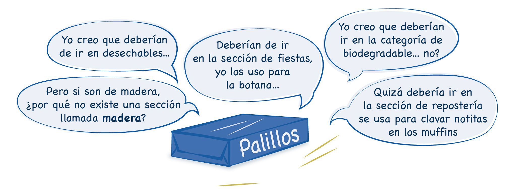
Thanks to the inventory tool in Odoo, it was possible to organize the information in a better way, since it allowed us to organize parent categories, subcategories, and labels for each item, favoring a faster and more intuitive search of the products (attached a short video where I show how to make a parent category and subcategory).
This allows that when locating a product of your interest, recommendations related to the product you chose are displayed. This is the same dynamic that applies in supermarkets, as you walk through the aisles you come across "free samples" or promotions that make you buy things on impulse, here they also exist and are called cross-selling.
