Tomorrow we celebrate the International Day of the Graphic Designer, an ephemeris that we have celebrated since April 27, 1995, commemorating the founding of the International Design Council. This a special day to recognize the changes that have emerged in history and the adaptability of designers, You make it great!
Like other communications and arts disciplines, graphic design has changed over the years, often as a consequence of technological advances or new consumer trends. One of these advances was the advent of the Internet.
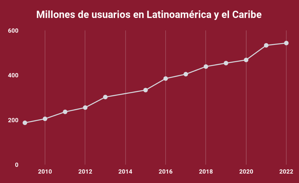
With the democratization of the Internet, the number of users worldwide who can connect to a device to surf the web has increased. This growing trend led us to have more than 541 million people with access to this service in Latin America and the Caribbean alone, while in 2009 we barely reached 186 million (according to the survey of 2022 Number of internet users worldwide, by region).
This growth has caused our consumption habits of information, entertainment, and even means of interpersonal relationships to be transferred to different types of screens, also causing the phenomenon of young generations explaining to their parents and grandparents how to use new technologies.
But who is in charge of designing the platforms we consume? Why are there platforms that any 3-year-old child can handle? How can we make anyone who accesses our platforms feel familiar with them? This is the job of a Graphic Designer specializing in UX / UI, we explain.
Fortunately for this creative guild, changes, and technological advances have increased their job opportunities, and today we find at least these main branches of design:
This is one of the best-known and oldest specialties. It involves the layout of all types of publications, from magazines, books, and newspapers, to brochures, leaflets, catalogs, and even menus, invitations, and postcards, which can be destined for print media but also digital, such as ebooks.

As old as editorial design, this specialty deals with the creation of different types of lettering to create a style and personality in written materials, being responsible for the legibility, aesthetics, functionality, and visual coherence of all material that uses letters.

Its main objective is to attract attention, generate emotions, and persuade through a visual product that presents a product, brand, or service. This type of design is at the service of marketing.
With objectives ranging from advertising to product development, this type of design focuses on creating eye-catching, functional, and informative packaging that is the ultimate sensory hook for customers. Getting the customer to judge the book by its cover.

It takes care of all visual aspects related to the branding of a company, from creating a logo to merchandising, selection of corporate colors, mascots, and everything that lets your customers and competitors know that a product or service was provided by you.

Someone has to be in charge of designing those beautiful didactic materials, that is the job of the technical or educational designer. In this branch, materials have been created that capture and keep the student's attention, facilitating their learning. It can be recognized in the form of diagrams, maps, flow charts, and even toys.

One of the most recently born specialties, it unifies the knowledge of digital design with the knowledge of traditional editorial design. A multimedia designer can design virtual libraries, electronic publications, videos, and animations, seeking to make the content more accessible and interesting.

The protagonist of this article is the most current and is still under construction. A designer who focuses on this branch must be familiar with some web standards such as navigability, interactivity, and usability, in addition to having basic knowledge of HTML and CSS, especially for interacting with web developers with whom he/she will certainly work closely.

Web and mobile designers in addition to having clarity in programming and development processes can specialize in disciplines such as UX/UI design, precisely the one that helps us to make a user understand a website from the beginning and feel familiar with the applications from the moment of downloading them.
What does UX / UI mean?
They are two different concepts, but together they allow our experience to be like breathing: intuitive, easy, something you don't even have to think about because what you have to do is so obvious to your body.
UX: this is about user experience design. In this part as a designer you must move away from aesthetic thinking to understand the needs of your audience, who will use the site or app, what they will be able to search for on your site or app and what are all the navigation probabilities.
UI: stands for user interface design. After analyzing and understanding all the needs and possibilities, you reach the implementation phase, the UI, where your UX prototypes become reality through an aesthetic and interactive interface.
These are some of the key differences in understanding these concepts:
UX | UI |
| Strategy development | Icons, shapes, and images to make sense of them |
| User knowledge | Colors of the elements |
| Prototyping | Typography and variations |
| Scenario development | Page layout |
Like all disciplines, especially in the arts, sales, and everything in between, it must respond to current trends.
What are the trends in UX/UI?
Be careful with bright colors. Use them wisely to draw attention to specific points. As users, we don't need more stimuli in our lives.
Hello dark side! It has been proven how beneficial it is to switch our devices to dark mode, consider this option for your users.
Typographies, your great frenemies. Choosing fonts has never been an easy task, use one that identifies your brand and distinguishes it from the rest.
"Less is more" is still valid. Let the content of your interface "breathe", and show what is essential, without leaving out important information.
Animate. We are in a time when videos are everywhere, your interface cannot be the exception. Give video content to your visitors.
Remember that beyond the trends you must be clear that not all websites should work the same way, each type requires a different construction because your users come looking for different experiences.
A must!
What your business website should have
People will come to your site looking for answers, so you must nurture it with information that answers the most basic questions ever asked: Who? What? Where? How? When? Why?
Think of your site as the first letter of introduction to your customers, recognizing the possibility of them finding you through their trusted search engine while looking for something related to your products or services. Giving them answers to all the questions that arise when they think about what your company offers is an excellent technique to attract them to your website and start generating conversions.
On your website, you have the opportunity to give them answers to questions they had not asked and give them solutions to problems they did not know they had. That is why you must make clear the information about your brand and its differentiators, the services and/or products you offer, your address, the way they can obtain your products and/or services, how long your brand has existed, as well as your mission and values.
It's time to apply the UX/UI
A good website must be linked to a marketing and communication strategy focused on your customers. To achieve this you must know them in-depth, nobody wants to get to a website they do not understand. This requires research work and subsequent analysis of the information you get.
I. Research and analysis.

Understand your target audience. As in all research, you should start by defining your subject of study, your customers. If you already have a physical store, we suggest you create opportunities to engage in conversations, or interviews, with some of your frequent customers. Of course, you should not expect them to give you time and information for free, a reward for collaboration is always an excellent idea, promotions, discounts, or even free products or services.
Define the types of people. Despite their many similarities, your customers are not the same, right? Sharpen the differences and create different customer service profiles for them.
Structure the use cases. Different customer profiles may be looking for particular services or products. To create a better experience for each one, you can ask yourself (or ask them) what type of devices they will use to access your website, what information or actions they will look for on your website, and even what are their favorite websites where they have a similar need (shopping, contracting, customer service, etc.).
Draw a navigator experience map. According to each profile, make the navigation path of your visitors. Define what they will look for when they arrive, while they are on your site and what will conclude their visit.
II. Activate creativity.

Brainstorming with your team will allow you to create things that have never been seen before, and above all, that work. Having creativity meetings to brainstorm ideas will allow information to begin to take shape.
Define the flow of your users. After brainstorming ideas, create a diagram that allows you to build the visitors' path, their different stages, the buttons you expect them to click, and what will conclude their visit.
Model the interface. As a UX designer, you must create the model of the user interface, the Wireframe. A guide for the UI designer to capture the creativity and flow of the users in a visual framework.
III. Hello UI!

It's time to get the flow and interface going on a website that actually works.
Almost ready. Here the UI designer creates representative models, which can be interactive, and reflect the work of the previous steps.
Takeoff! With the models validated, the front-end and back-end developers will tackle the project and build the interface through code.
IV. Everything is under control.

Any project needs a follow-up phase to verify that what was found in the research and implemented is what our users are really looking for. We call this the follow-up phase.
Let your customers use it. You've implemented your website, you took care at every stage, and now it's time for your visitors to give you their opinion to know if it's really what they are looking for.
Popularity contest. Comparisons are your ally, so create A/B tests to define which of the two versions works in the best way. Both should be generated through the UX/UI process.
Numbers win. Analyzing the metrics that your website offers will allow you to understand what is working and what is not. It's time to be cool and not get carried away by personal preferences.
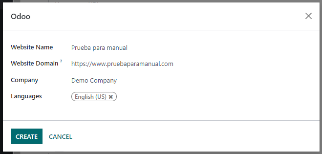
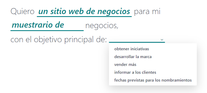
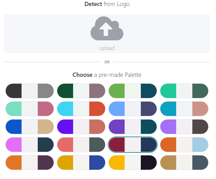
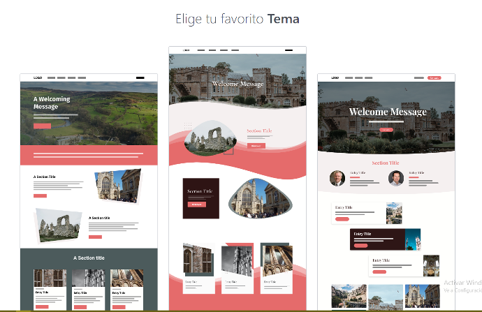
Implement UX/UI in your Odoo database
Implementing all of the above is a big job, but at Vauxoo we want to share with you some features of the website module that will allow you to implement everything. Don't forget to do the research, analysis, and creativity steps first.
As a UX/UI designer you will be able to make full use of the tools provided by the Website module, as you will be able to create pages, landingpages, activate functions and use the many templates available.
This will automatically open this page, where you must click on LET'S DO IT.
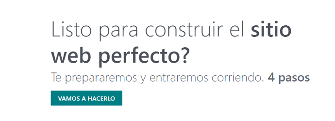
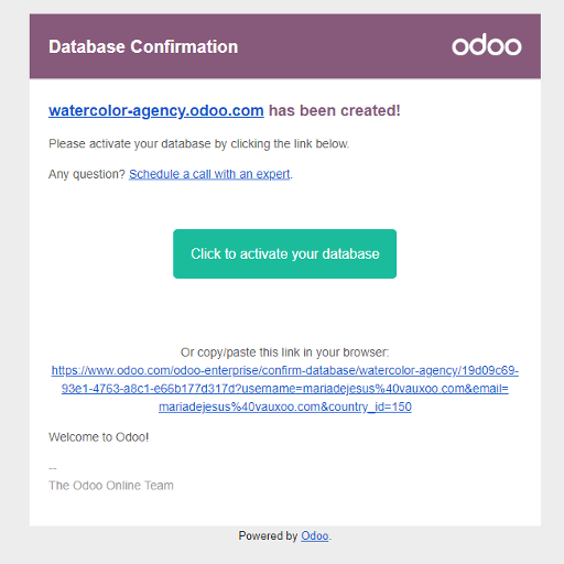
Click to activate your database, this will activate your trial instance for 15 days. If you already have Odoo you can skip this step.
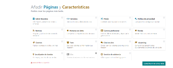
Based on everything you gathered in your research stage, add the Pages and Features you need to have on your business website.
Now you will be able to add all the pages, posts, events, products, forms, forums, jobs, courses, and LiveChat, according to what your company needs.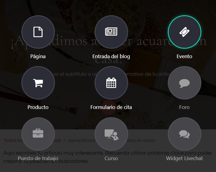
Customize every page with drag and drop:
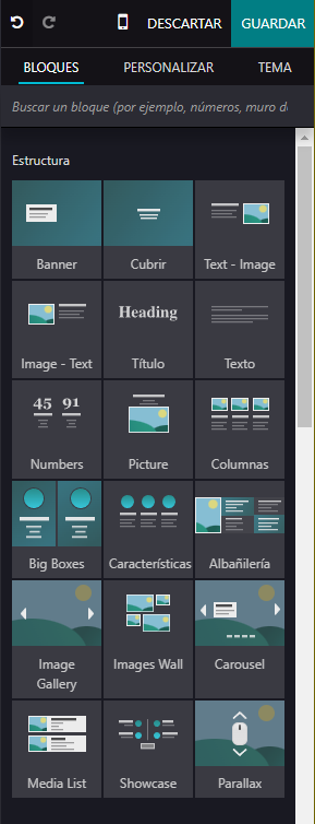
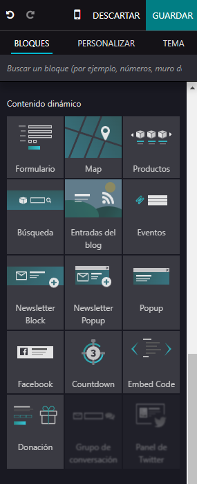
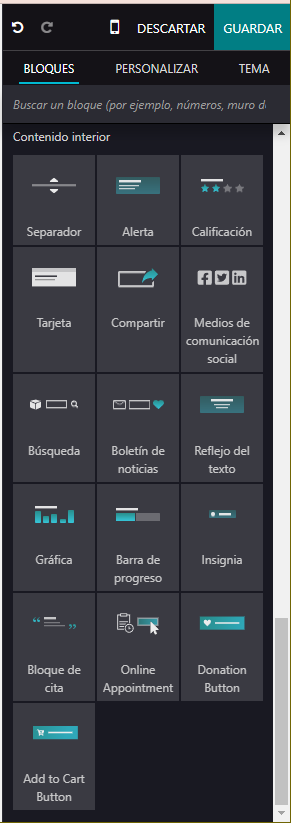

Use the mobile mode viewer to know how your visitors will see it from their mobile devices. Remember to optimize the views according to the devices your customers use the most. Always remember to click the Save button when making important modifications to your website.
Click on Publish, and ready, you will have a website to share with your clients as a letter of introduction.


Obeying all trends is impossible, but recognizing those that will allow us to remain competitive in the world of work is essential. Keeping abreast of new challenges through blogs, papers, and webinars will facilitate your understanding of trends and allow you to apply them in your day-to-day work.
