Por: Beatriz Lara UX/UI designer en Vauxoo
Reflecting on my day-to-day designing, I discovered that there were repetitive tasks and others that took me too long to complete. For this reason, I set out to experiment and test the new Adobe Suite 2024 and Odoo tools to speed up design deliverables and invest more time in tasks with a greater impact on the development of digital products such as research and testing with users.
Below I will show you the results of these explorations, my experience and my verdict on how useful they can be.
Table of Contents:
- Visualize designs in mockups using Adobe Illustrator.
- Editing photos and videos in Adobe Photoshop.
- Herramientas de AI para el Diseño Web.
Visualize designs in mockups using Adobe Illustrator.
One of the features that surprised me the most and which I didn't have high expectations for was the Mockup tool. With this feature, I can visualize how my designs will look in real life, which is a real gem.
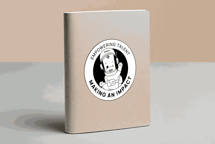
In my test, I used a previous design of Vauxoo's business mascot: Vakyro and tested it in different applications offered by Adobe Illustrator (2024). These can be legally acquired for commercial use or you also have the possibility of using free resources that do not belong to the gallery of options offered by Adobe Stock. Don't forget that it is always important to check the copyright details of any mockup or image that you download from the Internet.
Tested in Adobe Illustrator Beta (2024) using images from Adobe Stock.
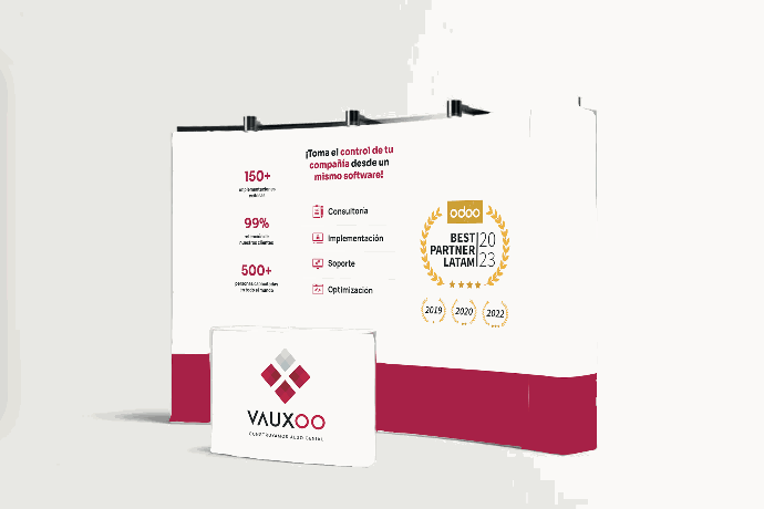
Quick tests made with free images from the Internet.
Vauxiana's opinion: This feature is perfect for making quick tests and showing internally at Vauxoo how a design would look in reality, without having to seek perfection from the start. I use JPG images and save time by not having to search for free resources on the Internet to edit them in Photoshop. However, when it comes to projects with clients, the story is different; I always strive for perfection and maximum quality, which means using other resources and investing more detail to increase realism in the final result.
Editing photos and videos in Adobe Photoshop
In my daily activities, Adobe's tools for removing unwanted objects, enlarging images, and adding new backgrounds have really impressed me. Using Adobe Photoshop's Generative Fill to enhance any photo is really easy, as it removes any unwanted elements from a scene without leaving a trace of what was originally there.
FPhotos edited with Adobe Photoshop Beta (2024) using Generative Fill.
Adobe Photoshop’s Generative Stretch tool is also a lifesaver, allowing me to extend images beyond their original borders, seamlessly blending new content with existing content. This has saved me from doing tricks and juggling, especially when I need to adjust the format of an image without losing its quality when designing for social media posts on Instagram and LinkedIn.
Photos edited with Adobe Photoshop Beta (2024) using Generative Upscaling.
Adding new backgrounds conveniently with Adobe Photoshop's Generate Background feature is another highlight, as you can change the entire context of an image in seconds. It's important to use descriptive language to get a more specific result.
Photographs edited with Adobe Photoshop Beta (2024) using Generate Background using the instruction: “corporate office in red and black tones, with smooth floor and work desks and chairs.”
The Generate Backgrounds tool can also be used in video projects to stretch backgrounds and adjust aspect ratios without having to make detailed manual adjustments. To get the final result in MP4 format, it will be important to click Export > Render Video.
AI Tools for Web Design
AI Color Palette Generator AI-powered palette helps you create consistent, attractive, and appropriate color palettes to get the best color combination for your projects by editing them. In turn, the pre-generated palettes are a great starting point for those moments of creative blocks where you don't know where to start.
In addition, real-time visualization is a great advantage because I can instantly see how the colors will be applied in my designs, which greatly speeds up decision making.
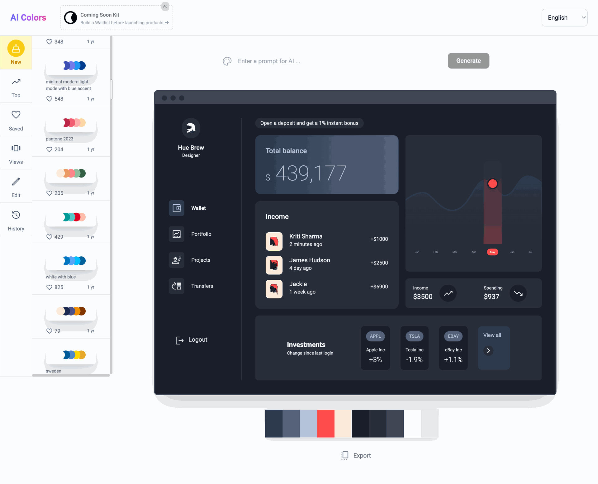
Opinión Vauxiana: Lo que realmente me gustó es la posibilidad de ver cómo se ve aplicada la paleta de color en distintos dispositivos digitales, ya sea en mobile, dashboards, landing page o portafolio. Esto es un gran plus porque, aunque existen otras herramientas que generan paletas de colores, pocas te muestran cómo se ve aplicado en un diseño. Ver los colores en contexto me ahorra tiempo en pruebas adicionales y ayudan al cliente a definir un estilo visual de la marca, especialmente al inicio del proceso de diseño de una identidad visual o sitio web.
Relume crea de manera rápida y sencilla un sitio web desde: Mapas de Sitio, Lo-Fi Wireframes y próximamente ofrecerán una nueva función de UI Style Guide. Utiliza +1,000 componentes responsive para utilizar según tus necesidades, los cuales podrás exportar a Figma para el diseño UI o Webflow para su desarrollo.
También tiene la opción de definir el idioma en que quieres que se desarrolle el proyecto y la opción de regenerar el Copywriting del contenido para hacerlo más corto, largo, definir el número de líneas o cambiar el tono a formal o amigable, algo que también es posible realizar en el módulo de Website o desde cualquier otra aplicación con Odoo v17 and its integration with GPT Chat.
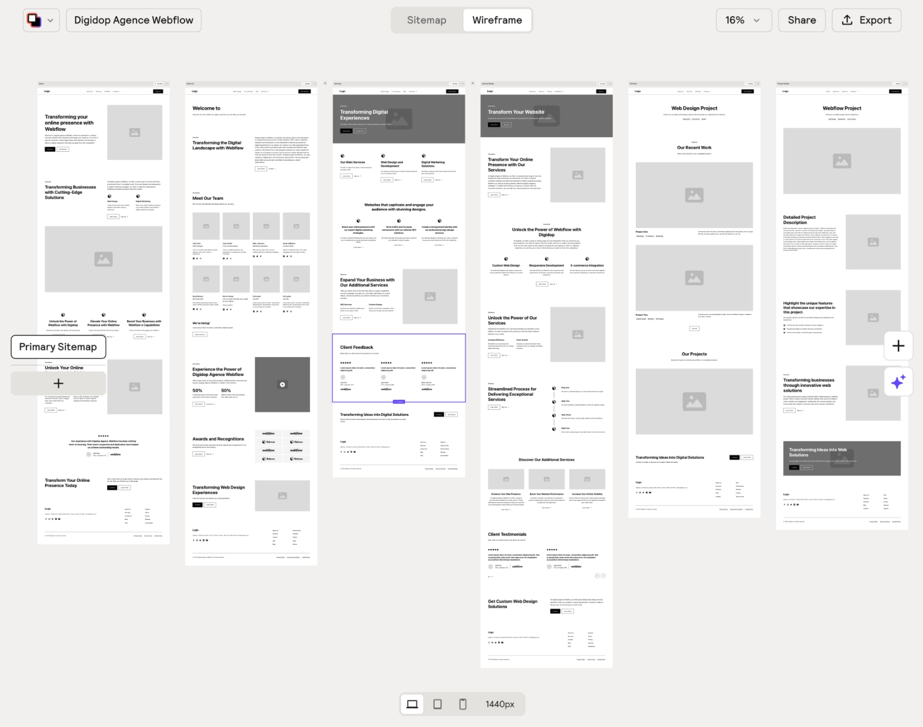
Vauxiana's Opinion: Although it is most commonly used for sites developed in Webflow, I believe that the Sitemaps and Wireframes feature can be very useful for any designer using Odoo, as you can generate ideas on how to define the content and obtain responsive Lo-Fi Wireframes in a matter of seconds with the possibility of exporting them to Figma and adapting them to the native snippets of the Odoo Website module or integrating them through custom code.
It is important to note that this cannot replace user research, testing, and other tools that help define the specific needs of the client and the end users of the site.
Although there are currently automated solutions that speed up our design process, it is important to remember that these do not replace the experience and critical judgment of a UX/UI designer. The final look of a website, from typography selection to accessibility review, are elements that require a human touch. These decisions not only define the aesthetics of a project, but also its functionality and accessibility, ensuring that the design is effective and appealing to all users. Therefore, continuing to learn and adapt to new technologies not only enriches our skills, but also allows us to continue offering unique and irreplaceable value in each project.
